
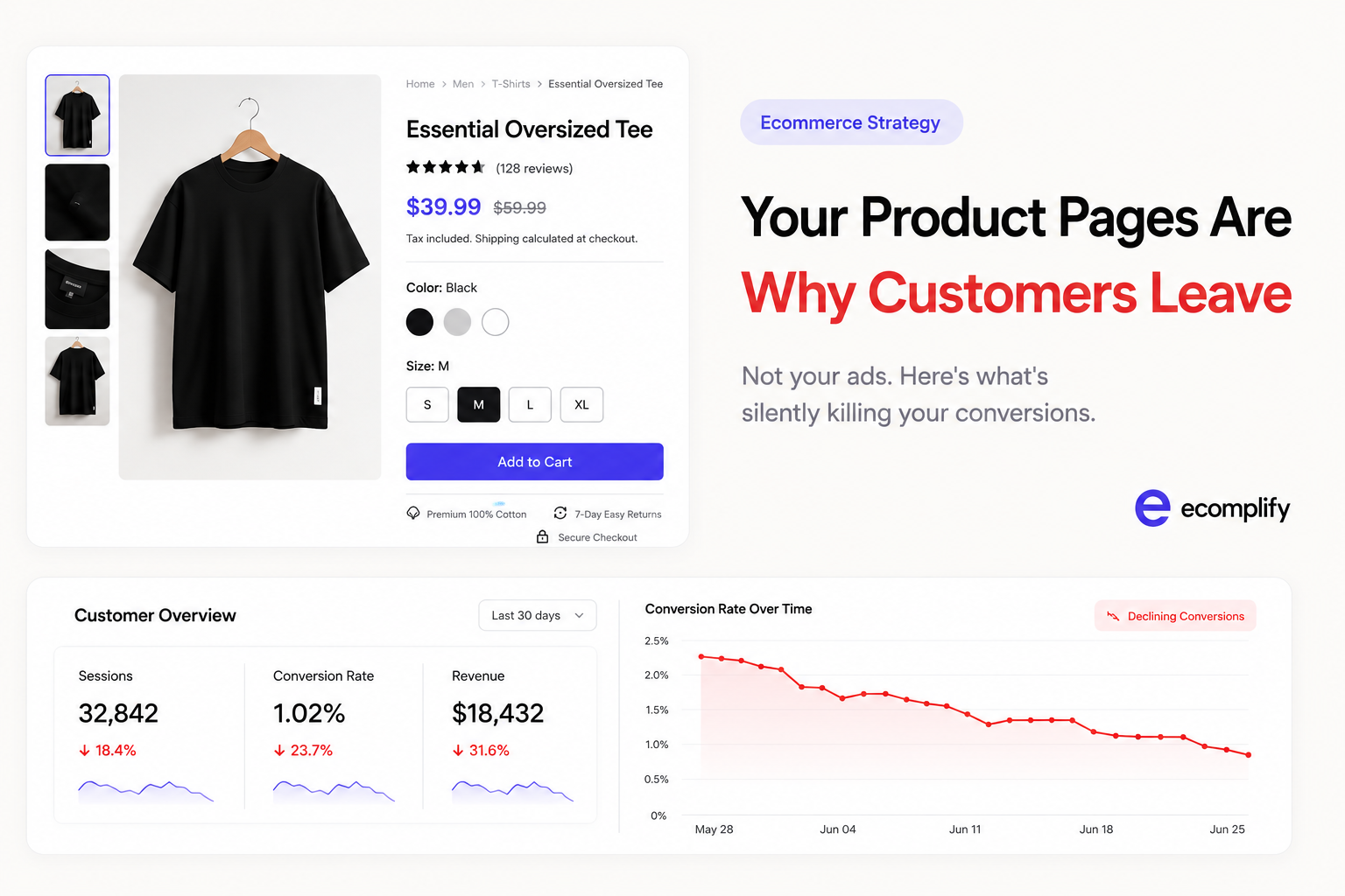
Your Product Pages Are Killing Conversions. Here's the Fix.
Most brands blame traffic when conversions are low. But the ad is rarely the problem. A visitor who clicks and bounces is signaling a product page issue — not an audience issue. Here's what high-performing product pages do differently, and how to fix yours.
You ran the campaign. People clicked. And then nothing.
No add-to-cart. No checkout. Just a bounce.
Most teams respond by increasing ad spend, tweaking audiences, or testing new creative. They keep optimizing the top of the funnel while the real leak is happening further down.
The problem is the product page.
It is the single most important page in your entire store. Not the homepage. Not the collection page. The product page is where a stranger decides to become a customer — and most brands treat it like an afterthought.
Here is what is quietly killing your conversions, and what to actually do about it.
Your Photos Are Doing Less Work Than You Think
When a customer lands on your product page, the first thing their eye goes to is the image. Not the price. Not the title. The image.
And if that image is a flat, poorly lit shot on a white background — you have already lost them emotionally, even if they keep scrolling.
The brands that convert well use images to answer questions before the customer can ask them:
- What does this look like on a real person?
- How big is it actually?
- What does the fabric or texture feel like up close?
- What does the back of it look like?
A single hero image does not answer any of those. You need a minimum of 4–6 photos per product:
| Shot Type | What It Answers |
|---|---|
| Hero shot | First impression, clean and confident |
| Lifestyle shot | "Does this fit my life?" |
| Detail / texture close-up | Material quality, craftsmanship |
| Scale reference | Actual size in context |
| Back / side view | No surprises on delivery |
| Video / 360 spin | Motion and feel in real use |
For scaling brands with large catalogs, consistency matters more than perfection. What you need is intention: every image should answer a specific customer question. A clear brief and a repeatable shot list will outperform a one-off studio session.
And here is something most merchandising teams miss — your images also affect your search performance. If your product images are generic or inconsistently tagged, even a smart search system cannot read them accurately.
AI-powered search like Intelli AI Search uses Vision AI to actually look at your product photos and extract tags automatically — color, style, category, material. If your image quality is low or your tags are inconsistent, a customer searching "white linen shirt under $80" won't find your product even if it matches perfectly.
Product photography is not just a design choice. It is a discoverability choice.
Your Description Is Describing, Not Selling
Read your current product description out loud. Is it a list of specs? Does it say things like "high quality material" or "suitable for all occasions"?
That copy is invisible. Customers skip it entirely because it tells them nothing they couldn't already see in the photo.
A description that converts does three things:
- It talks to a specific person — not "everyone"
- It answers the objection they are most likely to have before they buy
- It tells them what changes after they own this product
Here is a simple reframe. Instead of:
> "Soft cotton blend, available in 3 colours, machine washable"
Try:
> "Made from 100% breathable cotton so you stay comfortable through a full day of meetings or a long flight. Washes well and keeps its shape after repeated use — no ironing needed."
Same facts. Completely different feeling.
If you have a large catalog, rewriting every description manually is not realistic. This is where AI-assisted catalog tools pay for themselves — you provide the product details, it drafts the copy, your team reviews and publishes. Done in minutes per SKU, not days.
Your Price Has No Context
When a customer sees your price, they are not asking "is this cheap?" — they are asking "is this worth it?"
If there is nothing on the page to anchor what "worth it" looks like, their brain defaults to "feels expensive" — even if your price is fair or even low.
You create context through a few things:
- Show compare-at vs sale price — the strike-through does the work
- Break down what's included for bundles or kits
- Cost-per-use framing for durable items: "Lasts 2+ years — that's less than $2 a day"
- Comparison anchor against a more expensive alternative they might already be considering
Trust signals matter here more than most teams realise. A visible return policy, a delivery estimate, and a few authentic reviews placed near the price — not buried at the bottom — dramatically reduce the hesitation gap before add-to-cart.
Your Page Is Making Customers Work Too Hard
Every extra tap or scroll to find information is friction. Every piece of missing information is a reason to leave and search for it elsewhere — probably on a competitor's page.
Run this quick audit on your product pages right now:
- Can a customer figure out the return policy without leaving the page?
- Can they see estimated delivery time before clicking add-to-cart?
- Is the size guide one tap away — not a separate page in a new tab?
- Is there a clear answer to the most common question about this product?
If the answer to any of those is no — fix it before you spend another dollar on ads.
Also check your mobile experience specifically. More than 70% of ecommerce traffic comes from mobile. If your product images are tiny, your description is squashed into unreadable text, or the add-to-cart button requires a scroll — you are losing customers who were already interested enough to click.
The Fix Is Usually Smaller Than You Expect
You do not need to redesign your entire store. In most cases, the 20% of changes that drive 80% of the conversion improvement are:
- Adding 2–3 more photos to your top-selling products
- Rewriting descriptions for your top 10 SKUs
- Adding return policy and delivery estimate directly on the product page
- Making sure mobile experience is clean and the CTA is visible without scrolling
Start with your 10 best-selling products. Treat those pages like landing pages — because that is exactly what they are.
Once those are dialled in, the rest of your catalog catches up faster because you have a template that works.
One More Thing About Search
If your product pages are good, you still need customers to actually find them inside your store.
Search is the fastest path from intent to purchase. A customer typing "dark blue formal shirt size L" is telling you exactly what they want to buy — they just need your store to connect that intent to the right product.
Most store search tools fail because they only match exact keywords. If a customer types "navy formal shirt" and your product is tagged "dark blue office wear" — they get zero results. That is a lost sale you will never see in your analytics.
The solution is search that understands meaning, not just keywords. Search that looks at what the customer actually meant, not just the exact words they typed. That is what AI-powered search does — and why stores that add it typically see a measurable lift in conversions within the first few weeks.
Good product pages and smart search are not separate problems. They are the same problem: helping the right customer find the right product with zero friction.
Fix the pages. Fix the search. The traffic you already have will start converting.
Ecomplify comes with Intelli AI Search built in — vision-powered, meaning-aware, and ready the moment you import your catalog.
Have questions about optimizing your store? Talk to the Ecomplify team.
Last updated August 5, 2026